Frog Website
Frog Website Redesign
The Frog website needed an overhaul because it was not serving as a business tool, the navigation was confusing, and it was a lot of work for the editorial team to create new case studies and blog posts. The redesign was an opportunity to make the site about the firm’s work and strategy and to create a system of modules that could be used in different combinations to build case studies. We began by looking at the site structure and radically simplifying the navigation to the key pages
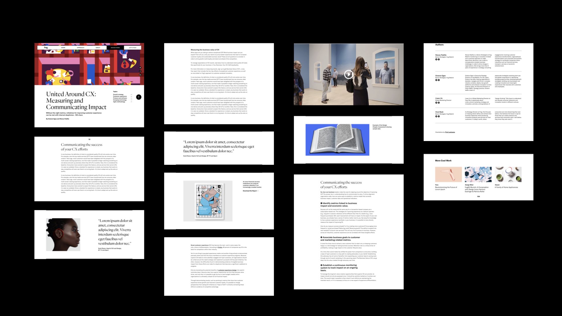
We created an immersive scrolling experience that highlights the work and the key points of each case study. The simplified typography allows key messaging and the work to come forward
We simplified the design of their blog —Design Mind— minimizing images and prioritizing ideas through larger typography with a system of modules for case studies
Modules can be selected within the CMS to build the story of each case study or blog post
The new information architecture is more streamlined with fewer pages and clear page titles
Before we redesigned the site it featured bright colors and high contrast serif typography. The site redesign was the first step in the evolution of Frog’s site and design system.
Credits
Client: Frog design
Creative Director: Anthony Pannozzo
Site Design and User Experience: Cybele Grandjean, Casey Wu, Sarah Moran
Editorial Director: Oliva Murphy
Front-End Development: NetiApps


